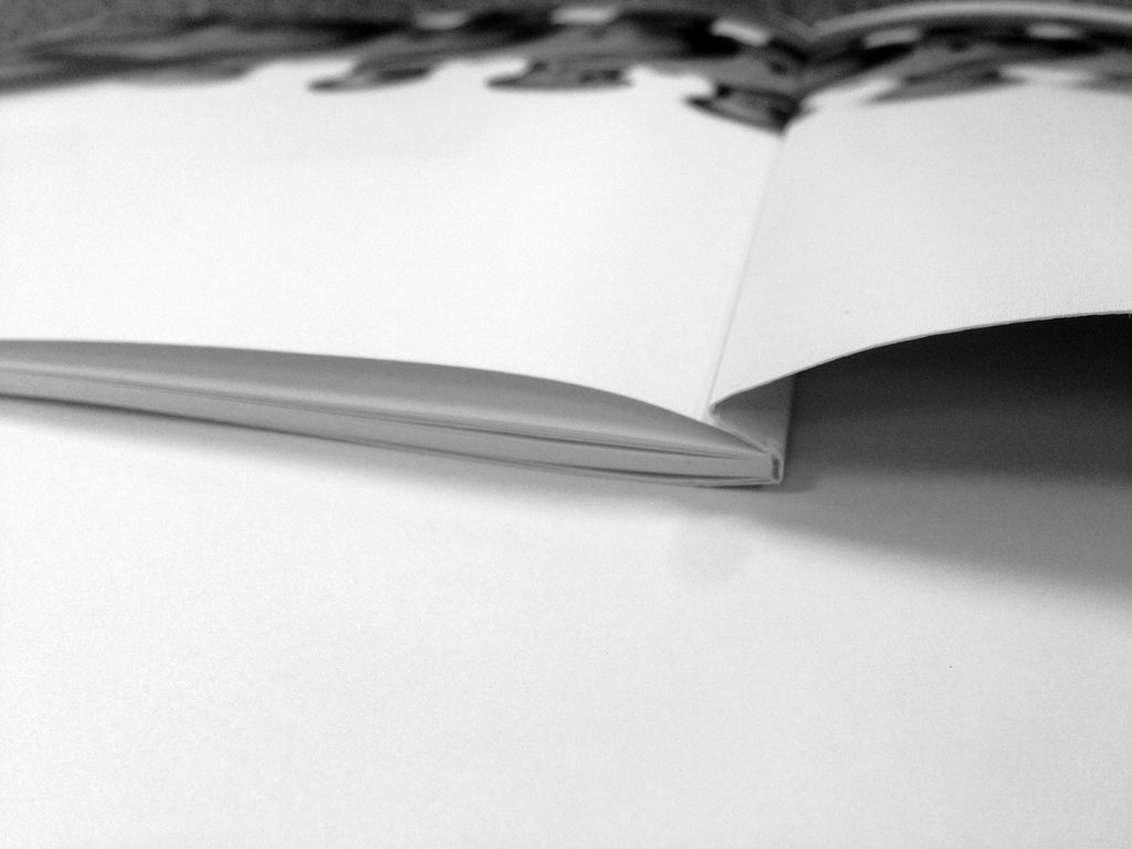
Perhaps the most challenging print issue a designer can face is when you have an image spanning across the inside front cover and the first text page of perfect bound books.
A savvy designer will crop and manipulate an image so that a little mis-calculation won’t be so glaringly obvious, but not every image can be that flexible, so we’ve put together a guide to help you get that alignment just right.
Let’s start with a little background about why this alignment is such a challenge. With a perfect bound book, there is a small hinge on the cover that conceals a small line of glue that bonds the first text page to the inside front cover. That hinge is typically anywhere from 5mm to 10mm wide. The image on the cover needs to bleed into the hinge by 2mm (but no more as excessive ink within the hinge affects the glues ability to make a good bond) and by the same token, the image on the first text page must extend into the hinge area by the same amount. So there is an overlap area, complicated by the fact that the hinge obscures the first part of the first text page.
Subsequent pages in your book don’t have a hinge, so you don’t need any special consideration for double page spreads throughout the rest of the book — it’s just the inside front and inside back covers that require special attention.

Our first step in getting this right is that we have to ask our printer what the hinge size will be (it will vary depending on cover weight, text weight, page size etc). In the example we’re going to work through here, the hinge size is 7mm, our book is A5 size and the spine thickness is 5mm.
Let’s start laying up your cover. When flattened out the cover will be 210mm by 301mm (148 + 5 + 148) so set your finished page size up at this size and set a 3mm bleed. Make a 2 page document. Page 1 is the OUTSIDE front and back cover. Page 2 is the INSIDE front and back cover.
Navigate to page 2 (inside) and place a non-printing blue guideline at 141mm from the left (your page width less the hinge amount), then another at 148mm (your page width), another at 153mm (your page width plus 5mm spine) and the final one at 160mm (a further 7mm (the hinge amount) from the back cover spine edge).
Next we want to draw in a registration guide line outside the bleed area and sitting right on the front cover hinge line. All going well, you’ll have a spread that looks like diagram 2.

Now make a frame that covers the inside front and back cover area (307mm x 216) and place your image within the frame. You can save this, and now it’s time to move across to your text page document (your text pages should be in a separate document to the cover).
Navigate to your first text page and place a blue non-printing guide at 7mm from the left most edge. Draw a small black line outside the bleed area on the hinge line to act as another registration guide.

Now go back to your cover document and select both the image frame and the registration guide line. Copy these two objects to the clipboard and then navigate to your text document again. Paste your clipboard contents using the “paste in place” command. This will ensure that vertically your pasting ends up in the right place — horizontally it won’t be, because the width of your text pages is quite different to the width of your cover page. Make sure you don’t un-select the two pasted components as we want the image and the registration mark from the front cover to stay together during the next step.
Move the image and the cover registration guide horizontally until the cover registration guide ends up sitting on top of the text page registration guide. Your image frame is now in perfect unison on both the cover and the text page — all that remains now is to use the image frames to crop out unnecessary parts of the image.

The most important thing we need to keep in mind when tidying up, is that we want 2mm of image to extend into the 7mm hinge area on both the inside cover and the first text page. That leaves 5mm of white space for the glue to have all to itself.
The second most important thing is, when cropping, don’t let the image move. You should be able to use the selection tool to adjust the size of the image frame which won’t actually change the size and position of the image itself — it will just crop out parts of the image so that you end up with a result looking something like diagram 5. You can remove your registration guides now, as they’ve served their purpose.
The acid test is, if you were to make a pdf (without bleed) of your text page and cover, crop 7mm off the left edge of the text page, then crop 160mm off the right edge of the cover (that’s the back cover, plus the spine plus the hinge) and then bring the two together, the image should line up perfectly across the cover and text page. Of course, the ultimate test is to have us print a proof copy and we’ll soon see how good your maths has been.

